Create an accessible dropdown with Phoenix LiveView
Do it yourself dropdowns are easy and fun!
originally published
Dropdowns are one of those UI controls that exist in a deceptive space between trivial to implement and complicated to get right .
We'll explore the following topics & techniques in this article:
- The difference between functional and stateful components in Phoenix
- Creating dropdowns with vanilla JavaScript
- Usage of the Web Animations API
- Accessibility concerns for dropdowns
- Styling dropdowns with Tailwind
- And much, much more!
Criticism Warning : I am going to be sharing a bit of criticism on what may be considered the idiomatic way of writing LiveView components. I’m not a huge fan of Phoenix.LiveView.JS and I will be sharing that viewpoint here. If you don’t like that, or if you really love that, please feel free to tell the world on twitter dot com .
We’re going to do this with a functional component in Phoenix . At the time of writing, Phoenix (and/or LiveView) has two main component options:
- Functional components are like a pure function—they take a set of inputs and render, and that’s about it.
- LiveComponents on the other hand have their own local state. They run inside the LiveView process they’re a part of, and because of that have more overhead in terms of complexity. You should prefer using functional components whenever possible.
Quick side note : a lot of what we’re going to cover is really just JavaScript. There’s a lot here that can help you even if you’re not a Phoenix developer.
We’ll add this functional component to core_components.ex , which is a pattern you should be familiar with if you have an app on a recent version of Phoenix:
defmodule ExampleWeb.CoreComponents do

  # ... your other components here

  def dropdown(assigns) do
    ~H"""
      <div>cool dropdown incoming</div>
    """
  end
endcore_components.ex
Let’s put the first piece in we talked about, a button:
def chevron_down(assigns) do
  ~H"""
  <svg
    class="-mr-1 h-5 w-5 text-gray-400"
    viewBox="0 0 20 20"
    fill="currentColor"
    aria-hidden="true"
  >
    <path
      fill-rule="evenodd"
      d="M5.23 7.21a.75.75 0 011.06.02L10 11.168l3.71-3.938a.75.75 0 111.08 1.04l-4.25 4.5a.75.75 0 01-1.08 0l-4.25-4.5a.75.75 0 01.02-1.06z"
      clip-rule="evenodd"
    />
  </svg>
  """
end

def dropdown(assigns) do
  ~H"""
  <button
    type="button"
    class="inline-flex w-full justify-center gap-x-1.5 rounded-md bg-white px-3 py-2 text-sm shadow-sm ring-1 ring-inset ring-gray-300 hover:bg-gray-50"
  >
    Menu
    <.chevron_down />
  </button>
  """
endcore_components.ex
Note about icons : recent Phoenix generators I think start you with some new package for icons (using TW heroicons). You may just want to use that. I’m leaving this implementation out of subsequent code samples, but it’s here if you want it.
I’ve provided some Tailwind styles here to get you started. I think this comes from an official example, but you can obviously tweak it as you want.
Now we need a menu to open up. Here we’re going to use a named slot in our Phoenix.Component :
slot(:content, required: true)

def dropdown(assigns) do
  ~H"""
  <button
    type="button"
    class="inline-flex w-full justify-center gap-x-1.5 rounded-md bg-white px-3 py-2 text-sm shadow-sm ring-1 ring-inset ring-gray-300 hover:bg-gray-50"
    aria-expanded="false"
 >
    Menu
  </button>

  <nav hidden="true">
    <%= render_slot(@content) %>
  </nav>
  """
endcore_components.ex
We’re going to use a nav element for this purpose, because they make semantic sense for menus. We’ve also added the hidden attribute because we want this menu to be invisible to start. We will also be communicating the open/closed state of the control to screen readers through use of aria-expanded .
To render the menu on top of everything else, and pin it to the button, let’s wrap it all in a container with display: relative and add display: absolute to the menu. We’re going to add some more Tailwind styling while we’re at it to make it look good.
Future CSS sidebar : At some point in the future you may be able to use the ‘anchor’ spec to do this.
def dropdown(assigns) do
  ~H"""
  <div class="relative">
    <button
      type="button"
      class="inline-flex w-full justify-center gap-x-1.5 rounded-md bg-white px-3 py-2 text-sm shadow-sm ring-1 ring-inset ring-gray-300 hover:bg-gray-50"
      aria-expanded="false"
   >
      Menu
      <.chevron_down />
    </button>

    <nav
      hidden="true"
      class="absolute right-0 z-10 mt-2 w-56 origin-top-right divide-y divide-gray-100 rounded-md bg-white shadow-lg ring-1 ring-black ring-opacity-5"
    >
      <%= render_slot(@content) %>
    </nav>
  </div>
  """
endcore_components.ex
In order to toggle the visibility of this thing, we’re going to need to give it an id. We can target it any number of ways in JavaScript, but Phoenix.LiveView.JS uses ids for a lot of things. We’ll pass the id in as an attribute to the functional component, and construct ids for the button and menu from it, like so:
attr(:id, :string, required: true)
slot(:content, required: true)

def dropdown(assigns) do
  ~H"""
  <div class="relative">
    <button
      type="button"
      class="inline-flex w-full justify-center gap-x-1.5 rounded-md bg-white px-3 py-2 text-sm shadow-sm ring-1 ring-inset ring-gray-300 hover:bg-gray-50"
      id={"#{@id}-button"}
      aria-expanded="false"
  >
      Menu
      <.chevron_down />
    </button>

    <nav
      hidden="true"
      class="absolute right-0 z-10 mt-2 w-56 origin-top-right divide-y divide-gray-100 rounded-md bg-white shadow-lg ring-1 ring-black ring-opacity-5"
      id={"#{@id}-menu"}>
    >
      <%= render_slot(@content) %>
    </nav>
  </div>
  """
endcore_components.ex
We could also just give the container an id and reference #our-id > button and #our-id > nav , but this is fine. Now, to do the actual showing/hiding, we could just do this:
phx-click={
  JS.toggle(
    to: "##{@id}-menu",
    in: {"ease-out duration-100", "opacity-0 scale-95", "opacity-100 scale-100"},
    out: {"ease-out duration-75", "opacity-100 scale-100", "opacity-0 scale-95"}
  )
}core_components.ex
And presto! Phoenix.LiveView.JS is great about giving you these little helpers to manage quick little changes in JavaScript land. But what about syncing up the state of aria-expanded ? Well, we have set_attribute from Phoenix.LiveView.JS , so we’ll just use that right? We can extract it into a function like:
def toggle_dropdown(js \\ %JS{}, id) do
  js
    |> JS.toggle(
      to: "##{@id}-menu",
      in: {"ease-out duration-100", "opacity-0 scale-95", "opacity-100 scale-100"},
      out: {"ease-out duration-75", "opacity-100 scale-100", "opacity-0 scale-95"}
    )
    |> JS.set_attr(
      "aria-expanded",
      "???", # How do we get this value?
      to: "##{id}-button")
endcore_components.ex
How do we know the current value for aria-expanded ? Well, Phoenix.LiveView.JS doesn’t give us any options out of the box, so we can either:
- Use dispatch from Phoenix.LiveView.JS and write our own event handlers in JS directly
- Write a custom hook
- Or keep state on the server
To keep the state on the server, we’d need to turn this into a LiveComponent pretty much. That’s overkill for what should be able to happen entirely on the client side. So it’s really a choice, in my mind, between going deeper into writing your own JS to solve a problem like this, or embracing the composable hooks concept from LiveView.
What’s wrong with Alpine.js?
Allow me to go on a short rant about Alpine.js, HTMX, or Phoenix.LiveView.JS .
The problem you see above is the key complaint I have with these tools. They all more or less function by shoving magical strings into your HTML attributes that trigger JavaScript.
With some exceptions though, most of these tools do not allow you to execute arbitrary JavaScript. You are instead stuck within the bounds of what they give you.
But what about dispatch you may ask? Doesn’t that let you break out of the bounds of LiveView.JS ?
It does, but to me, this defeats the entire purpose of “put everything in an attribute” ideology. Clearly it doesn’t have to be all one way or the other: If you love what LiveView.JS provides, or HTMX, or Alpine, or whatever, you may decide you want to use as much of the platform it provides as possible , and only fallback to writing JavaScript when you absolutely need to. You may feel that way especially if you dislike JavaScript.
But personally, I do not dislike JavaScript. I rather like both JavaScript and TypeScript, and good vanilla JS solutions are one of the things this blog is about.
Vanilla JS
So instead, let’s make a new event handler called toggle that we’ll fire with dispatch . Add this somewhere in your main JS entrypoint:
document.querySelectorAll(`[data-component="dropdown"]`).forEach(el => {
  el.addEventListener('toggle', async e => {
    // 1. Get a reference to the button and nav.
    const button = el.querySelector('button')
    const nav = el.querySelector('nav')

    // 2. Bail out if they're not found.
    if (!button || !nav) throw new Error('dropdown component must have a button and a nav')

    // 3. Get the current state of the dropdown. Storing the state in aria-expanded is a good idea, because it kills two birds with one stone.
    const isOpen = button.getAttribute('aria-expanded') === 'true'

    // 4. Toggle the hidden attribute and aria-expanded.
    const toggleHidden = () => {
      button.setAttribute('aria-expanded', isOpen ? 'false' : 'true')

      if (nav.hasAttribute('hidden')) {
        nav.removeAttribute('hidden')
      } else {
        nav.setAttribute('hidden', '')
      }
    }

    // 5. Execute the toggle function.
    toggleHidden()
  })
})assets/app.ts
Then go back to the container we’re wrapping around the component, and add the data attribute:
def dropdown(assigns) do
  ~H"""
  <div class="relative" data-component="dropdown">
    <!-- rest of the component -->
  </div>
endcore_components.ex
I’ve noted above what these steps are all doing, so I won’t go into them in more detail here. Instead, let’s replicate the animation we would have had with toggle .
document.querySelectorAll(`[data-component="dropdown"]`).forEach(el => {
  el.addEventListener('toggle', async e => {
    const button = el.querySelector('button')
    const nav = el.querySelector('nav')

    if (!button || !nav) throw new Error('dropdown component must have a button and a nav')

    const isOpen = button.getAttribute('aria-expanded') === 'true'

    const toggleHidden = () => {
      button.setAttribute('aria-expanded', isOpen ? 'false' : 'true')

      if (nav.hasAttribute('hidden')) {
        nav.removeAttribute('hidden')
      } else {
        nav.setAttribute('hidden', '')
      }
    }

    // 1. First set will be the coming in, second set will be the going out.
    const keyframes = [
      { opacity: 0, transform: 'scale(0.95)' },
      { opacity: 1, transform: 'scale(1)' }
    ]

    // 2. Then set up animate function.
    const animate = async (keyframes: Keyframe[], options: KeyframeAnimationOptions) => {
      const animation = nav.animate(keyframes, options)

      await animation.finished
      animation.commitStyles()
      animation.cancel()
    }

    // 3. Then run the animation and toggle hidden!
    if (!isOpen) {
      toggleHidden()

      await animate(
        keyframes,
        { duration: 100, easing: 'ease-out', fill: "forwards" }
      )
    } else {
      await animate(
        [...keyframes].reverse(),
        { duration: 75, easing: 'ease-out', fill: "forwards" }
      )

      toggleHidden()
    }
  })
})assets/app.ts
TypeScript Note : You’re going to start seeing TypeScript. I hope you like it! If you don’t, you can remove the annotations and your left with plain JS. I will at some further time go over converting your JS entrypoint to TS, in another blog post.
Let’s dig into this one a little bit more. We’re going to use the Web Animations API to replicate what we would have had if we used toggle with a transition. The Web Animations API is not a super well-known one in my experience, but it’s basically a JavaScript wrapper around native CSS animations, which makes it as performant as doing everything in CSS, but lets us keep everything in JavaScript.
An entire rundown on how to use WAAPI is outside the scope of this article—I think you get the idea from the sample I’ve provided—but I want to touch on one thing:
  const animation = nav.animate(keyframes, options)

  await animation.finished
  animation.commitStyles()
animation.cancel()assets/app.ts
When the Web Animations API was created, it included a number of ‘fill modes’. This controls how multiple animations should stack, and what happens once the animation is over. A fill value of forwards just persists the final keyframe state forever on the element. It’s usage is currently discouraged, as it hijacks the ability to overwrite those styles later on with a style attribute. So instead we use the following technique:
- Use fill forwards, to persist it into the next step (we will clean it up in a second).
- Wait for the animation to finish, and then call commitStyles .
- Call cancel on the animation. This will clear up the issues with fill forwards.
As long as you do that, you’ll be in the clear with fill forwards and WAAPI.
Clicking outside
One more little handler:
document.querySelectorAll(`[data-component="dropdown"]`).forEach(el => {
  el.addEventListener('close', async e => {
    const button = el.querySelector('button')
    const nav = el.querySelector('nav')

    if (!button || !nav) throw new Error('dropdown component must have a button and a nav')

    button.setAttribute('aria-expanded', 'false')
    nav.setAttribute('hidden', '')
  })

  // other handler ...
})assets/app.ts
And then let’s add these two calls to dispatch in the component:
defmodule ExampleWeb.CoreComponents do

  attr(:id, :string, required: true)
  slot(:content, required: true)

  def dropdown(assigns) do
    ~H"""
    <div class="relative" data-component="dropdown">
      <button
        type="button"
        class="inline-flex w-full justify-center gap-x-1.5 rounded-md bg-white px-3 py-2 text-sm shadow-sm ring-1 ring-inset ring-gray-300 hover:bg-gray-50"
        id={"#{@id}-button"}
        aria-expanded="false"
        phx-click={JS.dispatch("toggle", to: "##{@id}-menu")}
        phx-click-away={JS.dispatch("close", to: "##{@id}-menu")}
      >
        Menu
        <.chevron_down />
      </button>

      <nav
        hidden="true"
        class="absolute right-0 z-10 mt-2 w-56 origin-top-right divide-y divide-gray-100 rounded-md bg-white shadow-lg ring-1 ring-black ring-opacity-5"
        id={"#{@id}-menu"}>
      >
        <%= render_slot(@content) %>
      </nav>
    </div>
    """
  end
endcore_components.ex
And we’re pretty much there! We now have:
- A dropdown we can open and close, including by clicking outside
- Correct representation of its state in aria-expanded
- Working animations and styling with Tailwind
There’s a few little improvements we can make:
A slot for the button
If we do this instead:
defmodule ExampleWeb.CoreComponents do
  attr(:id, :string, required: true)

  slot(:button, required: true)
  slot(:content, required: true)

  def dropdown(assigns) do
    ~H"""
    <div class="relative" data-component="dropdown">
      <button
        type="button"
        class="inline-flex w-full justify-center gap-x-1.5 rounded-md bg-white px-3 py-2 text-sm shadow-sm ring-1 ring-inset ring-gray-300 hover:bg-gray-50"
        id={"#{@id}-button"}
        aria-expanded="false"
        phx-click={JS.dispatch("toggle", to: "##{@id}-menu")}
        phx-click-away={JS.dispatch("close", to: "##{@id}-menu")}
      >
        <%= render_slot(@button) %>
      </button>

      <nav
        hidden="true"
        class="absolute right-0 z-10 mt-2 w-56 origin-top-right divide-y divide-gray-100 rounded-md bg-white shadow-lg ring-1 ring-black ring-opacity-5"
        id={"#{@id}-menu"}>
      >
        <%= render_slot(@content) %>
      </nav>
    </div>
    """
  end
endcore_components.ex
Then we can set whatever content in the button we want when we call this component. We also haven’t demonstrated what calling it looks like, so check it out:
<.dropdown id="main-nav-dropdown">
  <:button>
    Menu
    <.chevron_down />
  </:button>

  <:content>
    <a href="/links">Links</a>
    <a href="/posts">Posts</a>
    <a href="/admin">Admin</a>
  </:content>
</.dropdown>some_other_file.ex
Closing the dropdown with esc
When talking about accessibility, you’ll hear a lot of people talk about expected buttons/keys for this control or that. You can kind of have these discussions forever, because talking about expectation for application UIs is often times based in what the host operating system itself does, and this is not consistent. So my rule of thumb is that if a reasonable person may expect that interaction to work, I try to make it work. In the real world, I think you must validate these expectations with user research.
Terminology Note : The terms dropdown, select, combobox, autosuggest, etc, all mean slightly different things to different people. The control we’re talking about here is what I’d call a dropdown, but you may feel differently.
That being said, I do not bill myself as an accessibility expert: I’m just an engineer who’s interested in it. So all I can do is share with you my strategy for tackling these problems. There are people who do this exclusively, for a living, and you should listen to them for the final word on these issues.
But let’s tackle this one:
<button
  ... rest of the button ...
  phx-click={JS.dispatch("toggle", to: "##{@id}-menu")}
  phx-click-away={JS.dispatch("close", to: "##{@id}-menu")}
  phx-window-keydown={JS.dispatch("close", to: "##{@id}-menu")}
  phx-key="Escape"
>
  <%= render_slot(@button) %>
</button>core_components.ex
Well that was pretty easy. I was a little harsh on the ‘attribute-soup’ of LiveView JS or Alpine in the previous sections, but there are times where it does make things really nice.
Debouncing
One thing we have not tackled is any kind of debouncing. I would like to actually solve this with Phoenix.LiveView.JS , cause I think this simple kind of task actually is suited to just-throw-a-attribute-on-it thinking. Unfortunately if you try this:
<button
  ... rest of the button ...
  phx-click={JS.dispatch("toggle", to: "##{@id}-menu")}
  phx-click-away={JS.dispatch("close", to: "##{@id}-menu")}
  phx-window-keydown={JS.dispatch("close", to: "##{@id}-menu")}
  phx-key="Escape"
  phx-throttle="200"
>
  <%= render_slot(@button) %>
</button>core_components.ex
It doesn’t seem to work. At least for me. At the time of this writing, I am using LiveView 0.19.4 , so maybe this is a bug, I have no idea. I suspect this is a bug specifically with throttle interacting with dispatch .
If I use debounce instead of throttle, it does seem to work as advertised, but debounce waits before the action which I don’t want. That would result in a pause before the menu opens.
We could implement something like this in TS:
type ThrottleCallback<T, A extends any[]> = (...args: A) => T
const throttle = <T, A extends any[]>(fn: ThrottleCallback<T, A>, delay: number): ThrottleCallback<T | void, A> => {
  let waiting = false
  return (...args: A) => {
    if (!waiting) {
      fn(...args)
      waiting = true
      setTimeout(() => waiting = false, delay)
    }
  }
}Example of a higher-order function for throttling.
The issue with using a higher order generic function like this is that we need to throttle across both the toggle and close events we made. One of the problems with the implementation we wrote, is that if you quickly hit esc after opening the menu, you can break the animation. We want to throttle to at least the speed of the animation across both events. So let’s implement that! I will also be doing a bit of refactoring while we’re at it:
I’d recommend putting it in a file like dropdown.ts now:
const keyframes = [
  { opacity: 0, transform: 'scale(0.95)' },
  { opacity: 1, transform: 'scale(1)' }
]

const animate = async (nav: HTMLElement, keyframes: Keyframe[], options: KeyframeAnimationOptions) => {
  const animation = nav.animate(keyframes, options)

  await animation.finished

  animation.commitStyles()
  animation.cancel()
}

const pendingAnimations = (el: HTMLElement) => {
  return el.getAnimations().length > 0
}

const close = async (nav: HTMLElement, button: HTMLElement) => {
  await animate(
    nav,
    [...keyframes].reverse(),
    { duration: 75, easing: 'ease-out', fill: "forwards" }
  )

  nav.setAttribute('hidden', '')
  button.setAttribute('aria-expanded', 'false')
}

const open = async (nav: HTMLElement, button: HTMLElement) => {
  nav.removeAttribute('hidden')
  button.setAttribute('aria-expanded', 'true')

  await animate(
    nav,
    keyframes,
    { duration: 100, easing: 'ease-out', fill: "forwards" }
  )
}

export const setupDropdowns = () => {
  document.querySelectorAll(`[data-component="dropdown"]`).forEach(el => {
    const button = el.querySelector('button')
    const nav = el.querySelector('nav')

    if (!button || !nav) throw new Error('dropdown component must have a button and a nav')

    el.addEventListener('close', () => {
      if (!pendingAnimations(nav)) {
        const isOpen = button.getAttribute('aria-expanded') === 'true'

        isOpen ? close(nav, button) : undefined
      }
    })


    el.addEventListener('toggle', () => {
      if (!pendingAnimations(nav)) {
        const isOpen = button.getAttribute('aria-expanded') === 'true'

        isOpen ? close(nav, button) : open(nav, button)
      }
    })
  })
}assets/dropdown.ts
And then importing it and calling it somewhere in app.js or app.ts :
import { setupDropdowns } from "./dropdown"

setupDropdowns()assets/app.ts
It’s a good idea to wrap code like this that has side effects in a function. Importing a module that itself creates a side effect is not a great look.
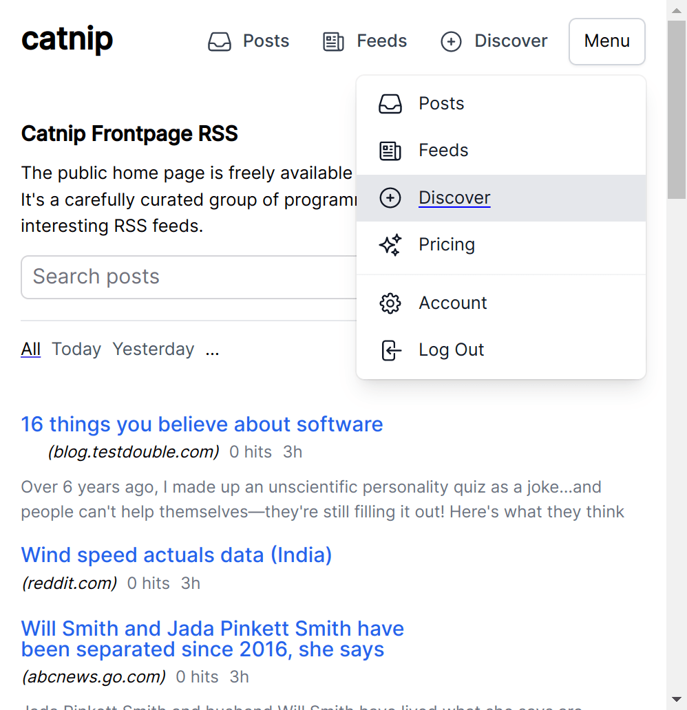
Results
This is kinda what it should look like:
undefined
Let’s go back over the final source code. First we’ve got the component itself in core_components.ex (or wherever you want to put it really!):
defmodule ExampleWeb.CoreComponents do
  # ... other components that you started with go here

  attr(:id, :string, required: true)

  slot(:button, required: true)
  slot(:content, required: true)

  def dropdown(assigns) do
    ~H"""
    <div class="relative" data-component="dropdown">
      <button
        type="button"
        class="inline-flex w-full justify-center gap-x-1.5 rounded-md bg-white px-3 py-2 text-sm shadow-sm ring-1 ring-inset ring-gray-300 hover:bg-gray-50"
        id={"#{@id}-button"}
        aria-expanded="false"
        phx-click={JS.dispatch("toggle", to: "##{@id}-menu")}
        phx-click-away={JS.dispatch("close", to: "##{@id}-menu")}
      >
        <%= render_slot(@button) %>
      </button>

      <nav
        hidden="true"
        class="absolute right-0 z-10 mt-2 w-56 origin-top-right divide-y divide-gray-100 rounded-md bg-white shadow-lg ring-1 ring-black ring-opacity-5"
        id={"#{@id}-menu"}>
      >
        <%= render_slot(@content) %>
      </nav>
    </div>
    """
  end
endcore_components.ex
Then we have the JavaScript/TypeScript we had to write. I put this in it’s own file called dropdown.ts :
document.querySelectorAll(`[data-component="dropdown"]`).forEach(el => {
  el.addEventListener('toggle', async e => {
    const button = el.querySelector('button')
    const nav = el.querySelector('nav')

    if (!button || !nav) throw new Error('dropdown component must have a button and a nav')

    const isOpen = button.getAttribute('aria-expanded') === 'true'

    const toggleHidden = () => {
      button.setAttribute('aria-expanded', isOpen ? 'false' : 'true')

      if (nav.hasAttribute('hidden')) {
        nav.removeAttribute('hidden')
      } else {
        nav.setAttribute('hidden', '')
      }
    }

    const keyframes = [
      { opacity: 0, transform: 'scale(0.95)' },
      { opacity: 1, transform: 'scale(1)' }
    ]

    const animate = async (keyframes: Keyframe[], options: KeyframeAnimationOptions) => {
      const animation = nav.animate(keyframes, options)

      await animation.finished
      animation.commitStyles()
      animation.cancel()
    }

    if (!isOpen) {
      toggleHidden()

      await animate(
        keyframes,
        { duration: 100, easing: 'ease-out', fill: "forwards" }
      )
    } else {
      await animate(
        [...keyframes].reverse(),
        { duration: 75, easing: 'ease-out', fill: "forwards" }
      )

      toggleHidden()
    }
  })
})assets/dropdown.ts
And import it in your main JS entrypoint (usually called app.js , but I’m using TypeScript):
import "phoenix_html"
import { Socket } from "phoenix"
import { LiveSocket } from "phoenix_live_view"
// ... other main import stuff
import { setupDropdowns } from "./dropdown"

// ... other main app setup stuff

setupDropdowns()assets/app.ts
And this is how you may use it:
<.dropdown id="whatever-id-you-want-to-call-it">
  <:button>
    Menu
    <!-- If you want an icon -->
    <.chevron_down />
  </:button>

  <:content>
    <a href="/links">Links</a>
    <a href="/posts">Posts</a>
    <a href="/admin">Admin</a>
  </:content>
</.dropdown>some_other_file.ex
Notice that we didn’t really need to add any aria stuff besides aria-expanded to track the state of the menu. Remember: by default, you usually don’t need (much) aria! With just this it should announce (in VO anyways) the state of the button being collapsed or not.
In a future post I may demonstrate adding the ability to tab into the dropdown directly. This is a technique I haven’t seen talked about a whole lot, but I personally think it’s a valuable one if you really want to make sure those links are immediately accessible to keyboard users.
Different Options
There are of course a lot of different options and different paths you can take here. On my own site, I began by using the sl-dropdown component from shoelace . This application is one where web components shine a lot, in my opinion. But I am very much in the camp of: if you can avoid introducing a dependency, you should do so—and that’s why I’ve presented this to you as simple code you can copy and paste into your own app rather then yet another dropdown library.
You could also choose to build more pieces in idiomatic LiveView ways, ie, building your own reusable hooks to accomplish the aria-expanded attributes, or using more of LiveViews transition features, but I choose not to do this for a couple of reasons.
LiveView moves at an incredible pace of development right now. There doesn't seem to be the time nor the inclination to build a fully functional JS interop system for everything you may want to do. You will end up writing a lot of hooks yourself if you do down this path.
At work, writing LV every day, I will do exactly that. But I'm quite comfortable with JS, so I find JS solutions more portable and easy to hack on. The magical attributes are nice when they do let you compose exactly the functionally you need, kind of frustrating otherwise.
I say portable because we really didn't do anything LiveView specific here. You could drop most of this post into a Rails app, or a JavaScript SPA, and it would look pretty much the same. While I think embracing the framework you're using is important, embracing the platform of the web is even more so: and that's what I encourage you to go out and do.